Juno
Your Cycle Care Companion
Mapply redefines navigation in busy spaces like Westfield Century City Mall. Think smart maps, AR directions, and rewards that make every step of your journey as efficient as it is rewarding.
My Role
UX Designer / Product Designer
Key Stakeholders
People with period
Tools
Figma, Adobe Illustrator, Procreate
The Brown Paper Bag
Growing up in Japan, I learned early that periods were something to hide. Every time I bought pads at the convenience store, the cashier would carefully place them in a brown paper bag first, then a plastic bag—as if the product itself needed to be concealed twice over. Male workers wouldn't make eye contact. I started to internalize that embarrassment, wondering why something so natural felt like a shameful transaction.
Even after moving to the US, that discomfort stuck with me. I avoided buying period products in stores. I'd order online instead, but then I'd forget I ordered them. Or worse, they'd run out before the delivery arrived. With ADHD, tracking my cycle felt like another task I was failing at. The "28-day rule" everyone talks about? Completely useless. My cycle shifts by 2-3 days every month, so I could never just think "okay, every 20th."
By the time my period arrived, I'd be unprepared—bleeding physically and mentally, scrambling to figure out how many tampons I had left.
I tried period tracking apps. Apple Health's interface wasn’t me. Other apps asked me to pay, and I thought: **why should I pay for something I'm not even looking forward to?** I'm already dealing with period pain. Shouldn't I be taken care of better?
That's when it clicked: the tools we have treat periods as a medical event to track or a transaction to complete, but they don't actually make us *feel cared for*.
Problem
The average person who menstruates will have approximately 450 periods in their lifetime, spending an estimated $6,000-$18,000 on period products alone.
Yet despite this being a universal experience affecting nearly half the global population, the way we manage periods hasn't fundamentally changed. We're still expected to predict, purchase, and prepare—all while dealing with cramps, mood swings, and the unpredictability of our bodies.
The period care industry is worth over $40 billion globally, but it's fragmented. In my research survey of 127 respondents, 69% reported running out of products during period at least once in the past year. Tracking apps help you predict your cycle but don't solve preparation. Subscription boxes deliver products but operate on rigid calendars, not your actual cycle. Self-care is treated as a luxury add-on, not an integral part of managing something your body does every month. Meanwhile, stigma persists—from brown paper bags in Japanese stores to partners who don't understand PMS to workplaces that don't accommodate period needs. The tools exist separately, but no one has connected the dots to create an experience that actually makes people feel cared for.
Design Challenge
How might we transform period care from a monthly chore into an act of self-love?
Meet Juno
Named after the Roman goddess who protected women throughout their lives, Juno is a cycle care companion that learns your unique pattern and delivers exactly what you need, when you need it.
Cycle Tracking That Doesn't Feel Like Homework Anymore
Your adorable avatar evolves with you, making tracking feel less like a chore and more like checking in with a friend.
Smart, Cycle-Synced Delivery
Products arrives 3 days before your period, perfectly timed to your body's rhythm. Customize everything from tampons to chocolate.
Thoughtful Circle Involvement
Share what you're comfortable with. Your loved ones get gentle reminders and can surprise you with care packages.
Research: Listening to Real Experiences
Survey Results (127 Respondents)
I did an online survey throughout September 15-30, 2025 via Google Form. Total of 127 people responded with useful insights. The survey not only validated what I was hearing, but also gave me interesting facts and opinions:
69% run out of products at least sometimes, causing stress and embarrassment
76% want automatic delivery timed to their actual cycle (not calendar-based)
42% cite "clinical feel" as a barrier to tracking consistently
81% would share cycle info with partners/friends if they had granular privacy controls
68% want self-care items included in deliveries
One open-ended response stuck with me:
"I wish my period felt more like... cozy. Like a cup of hot cocoa before bed. Like Christmas morning rushing to the living room when I was a kid. Or the first time I read Harry Potter. Does that make sense?"
Yes. It made perfect sense.
User Interviews (3 In-Depth Conversations)
I spoke with three people whose experiences represented different pain points.
Jessica, 27 - The Unprepared Planner
"I track my work deadlines religiously, but somehow my period always catches me off guard. I'm at school asking other teachers for tampons. It's embarrassing at my age."
She's organized in every other area of life, but periods still slip through. She wants to feel taken care of during her period, even if she's technically "taking care of herself."
Samantha, 34 - Living with PCOS
"My cycle is anywhere from 32 to 48 days. The app says my period is coming on the 15th, and then it doesn't show up until the 28th. I've given up trusting predictions."
Samantha over-buys products out of anxiety because she can't predict when she'll need them. She's not looking for a rigid schedule—she needs flexibility and pattern recognition for irregular cycles.
Marcus, 29 - The Well-Meaning Partner
"There are weeks where everything I do annoys her. We fight, and then a few days later she's like 'sorry, I was PMSing.' I wish I knew that in the moment so I could be more patient."
Marcus represents partners who genuinely want to support but lack visibility into cycle timing. He's not trying to be invasive—he just wants to understand and help.
Persona
Based on research, I developed three personas representing different user needs and behaviors.
Behaviors
Buys tampons at CVS when realizes running low (or already out)
Has emergency stash that's usually empty when needed
Tried tracking apps but forgets to log
Gets moderate PMS - emotional, breakouts, fatigue
Graphic designer at creative agency
Lives with roommate
In relationship (2 years)
Has ADHD
Regular cycles (28-30 days) but forgets to track
“I track my work deadlines religiously, but somehow my period always catches me off guard.”
Pain Points
Always forgets to buy supplies until it's too late
Gets annoyed at herself when period arrives unprepared
Boyfriend doesn't understand when/why she's emotional
Hates going to drugstore when already cramping
Period tracking apps feel like homework
Goals
Never have that "oh no" moment of starting period without supplies
Feel prepared and taken care of
Have partner understand what she's going through
Make periods feel less like a chore
Maya Chen, 26 - “The Underprepared Planner”
Behaviors
Tracks cycle religiously in Clue to identify patterns
Keeps supplies stocked everywhere (car, bag, bathroom, bedroom)
Buys different absorbency products (flow unpredictable)
Experiences irregular periods with varying flow levels
Marketing manager
Lives alone
Single, dating casually
Has PCOS - cycles range 28-45 days
Career-focused, travels for work
"My cycle is unpredictable, so I've given up trying to plan around it."
Pain Points
Can't predict when period will come
Over-buys products out of anxiety ("just in case")
Apps predict period but always wrong
Needs different products depending on flow (varies a lot)
Worries something's wrong but doesn't know what's normal for her
Goals
Find patterns in irregular cycle
Reduce anxiety about being caught without supplies
Understand if symptoms are normal or need medical attention
Have flexibility in product delivery
Priya Patel, 31 - "The Irregular Tracker"
Competitive Analysis
I looked at both direct competitors (subscription boxes, tracking apps) and indirect ones:
✅ Cute branding, self-care focus
❌ Calendar-based delivery (every 30 days), doesn't adapt to YOUR cycle
❌ No tracking integration
❌ No social/partner features
Tracking Apps (Flo, Clue, Apple Health)
✅ Sophisticated predictions, data visualization
❌ Very clinical aesthetic
❌ No product delivery
❌ Users get accurate predictions but *still have to remember to buy products*
Insight: The Gap
Nobody bridges tracking + products + emotional design. Each competitor solves part of the problem well but leaves significant white space.
Subscription Boxes (Rael, Lola, Cora)
User Journey Map
The user journey map illustrates the steps users take during the pickup process, aiding in pinpointing pain points and recognizing areas for improvement. Specifically focusing on the "Going to pick up" and "Parking" stages, the map revealed various user challenges and opportunities, prompting dedicated attention to these aspects throughout the design process.
Help stay notified of order updates.
How might we integrate food ordering sites with navigation?
Help me avoid any parking inconveniences as much as possible
How might we match estimates for food pickup with driving time?
How might we use AR on phones to guide customers through the mall?
How might we create more informative entry signs?
How might we create alternatives to physical mall maps?
How might we create dedicated pickup spots for those who don’t want to shop?
Some of the interesting insights we got from user journey map
(Pink: goals & motivation, blue: opportunities)
Overview of Mapply’s user journey map
(Click here to check out the detail)
Sketches & Wireframes
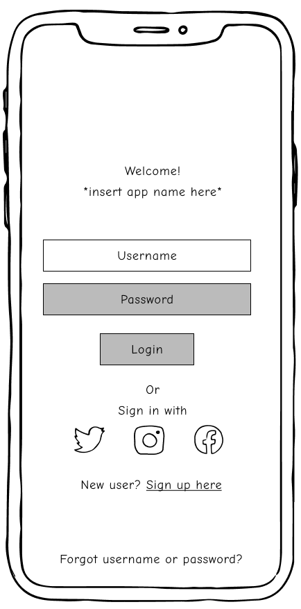
We sketched out our ideas for the initial visualization process based on insights from initial user interviews, our business goals, and a heuristic evaluation. It was like a quick test run to figure out what users genuinely need versus what could be optional. This way, we got a clearer picture before diving into the nitty-gritty of the design process.
After doodling our initial ideas, we brought them to life using Figma to create simple wireframes. These wireframes were fleshed out just enough to throw them into the user testing ring.
First paper prototype for Mapply which helped us to understand how it feels to interact with Mapply before creating a digital wireframe
First digital wireframes created based on the paper prototype
Usability Testing
We put our hands-on prototype to the test with 10 real users, watching them navigate and interact with the app. Our goal was to understand if participants understand how to move through the prototype and the purpose of Mapply app, and whether our AR walking directions are intuitive or not. We introduced our users with a brief synopsis, and set each user up with a brief background before observing their actions while moderating.
Testing Phase 1: Information Design
Insight: Problems to Solve
Information Overload
Users found the order summary page and the timer off-center, making it visually confusing.
Organize the Order Summary Page
We moved the timer to a more central location and consider making other adjustments to improve the visual hierarchy.
Unclear Category Labeling
Some users questioned the need to call out "restaurant" as a category, asking for more specific information.
Implementation: Revisions Made
Revise Category Labels
We implemented more descriptive or intuitive labels for categories beyond just "restaurant."
Small Font Size
Many of users found the text on the menu page and the AR information to be too small to read comfortably.
Improve Information Clarity
Font size and color contrast were increased, and we provided clearer explanations for potentially confusing terms.
Testing Phase 2: Feature Functionality
Insight: Problems to Solve
Missing Information
The purpose of entering the parking number and the details of the coupon offer were missing.
Limited Features
Some users expressed a desire for additional features, such as the ability to store coupons within the app.
Limited AR Functionality:
Users suggested additional options for AR navigation, including different paths for accessibility and seasonal changes.
Implementation: Revisions Made
Provide Context and Explanation
We added that the purpose of entering the parking number is to make sure that customer gets free parking while pickup.
Develop a Coupon Storage System
A system within the app where users can store and manage their coupons for easy access was created.
Expand AR Features
We explored adding different paths for accessibility and consider changing the color depending on events or seasons.
Solution
Mapply
After ironing out the wrinkles from our usability study, we dived into the creative process on Figma to craft the final screens.
Our mission was crystal clear: to cook up a visual identity that resonates with our brand's essence and message, summed up as "no more headaches, just good food." It's not just about looking good; it's about creating an experience that's as enjoyable as a fantastic meal.
With Mapply, users can find themselves happily benefiting from the program’s navigation system, where they can be directed throughout the mall with ease.
Key Features
AR Wayfinding
With Mapply’s AR wayfinding system, you are no longer have to worry about getting lost in a mall maze- simply just turn it on, and Mapply will get you to the exact spot you want to go.
Built-In Rewards
Mappy rewards malls, not just shoppers. After your shopping spree, the app gives exclusive points and discounts, tempting you to visit the mall again and uncover more spots. Track your rewards and expiring deals in a handy tab. ️
Navigation Made Easy
Mapply offers options beyond just AR. You can pop in your headphones and get audio directions or check out Mapply on your smartwatch, ensuring you don't miss a beat in busy areas.
Mapply Video Case Study
“No more headaches, just good food.”
Reflection
Building Mapply was an exciting adventure, full of challenges and triumphs. I learned how to spot problems, come up with solutions, and work with others to overcome obstacles. Collaborating with my amazing teammates was a blast, and it showed me how powerful teamwork can be in creating something truly special.
This was my first time working on a group project as a UX designer, and it opened my eyes to the importance of brainstorming and discussing ideas with other designers. I realized that every user and designer brings a unique perspective to the table, and that's what makes creating great products possible.
Mapply - What’s next?
Mapply has the potential to make a real difference in the lives of people who use shopping malls. I'm excited to keep learning and growing as we refine it and make it even better. I see Mapply going beyond food pickup, helping people with shopping, returns, and more. I can't wait to see how Mapply evolves in the years to come!
Digging Deeper: We'll do more online surveys and usability studies to figure out what else people need from Mapply. I'll also keep making improvements to the design to make it even more user-friendly, accessible, and up-to-date.
Designing More Screens: I'll keep designing screens for all the things we didn't have time to do before.
Expanding Services: We'd love to make Mapply work for more than just food pick-up. We're thinking about adding shopping for clothes, electronics, and all sorts of other stuff.
More Stakeholders: With funding from investors, we can bring Mapply to more Westfield malls, arenas, and other places.
Thanks for listening!
Do you have any questions? Please don’t hesitate, reach out to me :)
seike.yuka@gmail.com
Based in Los Angeles, California


